Through analysing three Contents page, I have tried to discover the common codes and conventions of a contents page of a magazine. I have done this research so that I can apply these codes and conventions to the product that I will be producing (Music Magazine). Although I had already done research about the codes and conventions of a contents page I decided that it will be a good idea to re-do this task again as I thought this would broaden and refresh my knowledge and about codes and conventions of a contents page for magazine. Armed With this research that I have currently just completed, along with the research that I had conducted during the preliminary task, I feel as though now I fully understand the codes and conventions of a contents page of a magazine and will be able to apply them to magazine that I will be producing. Below are print screens of the three researches that I conducted recently:
Analysis 1
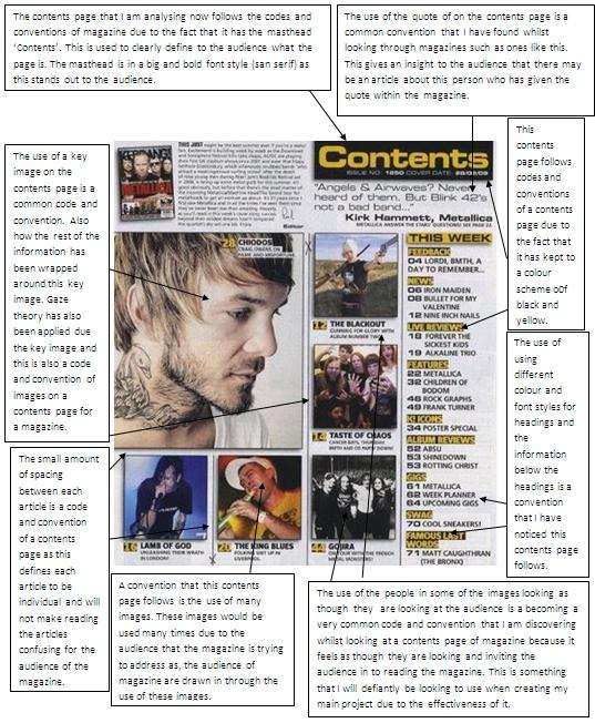
Analysis 2

Analysis 3

After conducting this research I have released there some key elements to following codes and conventions of a contents page for a magazine. These are things such as; keeping to a strict border line, use images to make the page more attractive and give an extra insight into what is in the magazine, use images were the character is looking at the audience, use a variety of colours and fonts, avoid dead space, the use a big bold and san serif masthead and the use of cover lines/lures and to use a masthead to clearly display what the page is and try to make this masthead clear to the audience. All of these code and conventions are ones that I will be trying to apply when creating my first drafts.
No comments:
Post a Comment