Tuesday 28 February 2012

Music Magazine-Analysis of Magazine-Contents Page-Genre Research

Below are my three anlaysis of contents page for genre research:

Analysis 1

Analysis 2

Analysis 3
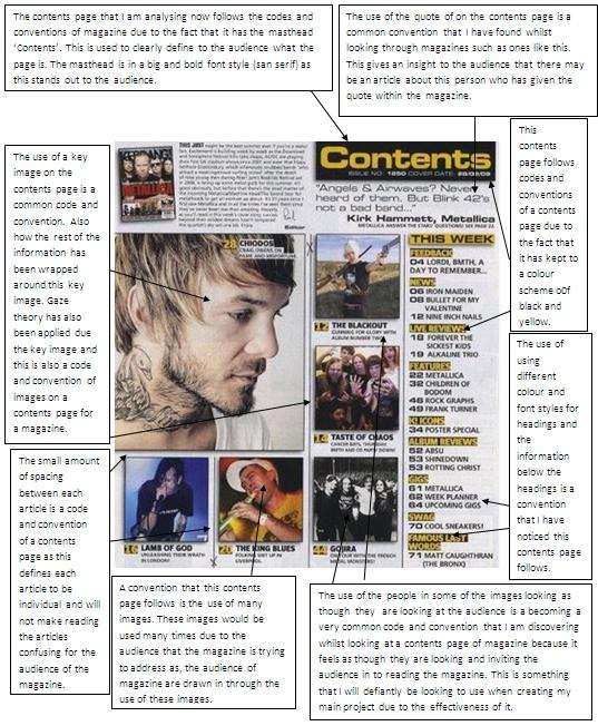
Through analysing these three components. I have learnt a lot about iconic attributes and conventions for magazines of the rock/metal genre. Some of these key features that I have learnt and will apply when creating my product are things such as; The broken effect used which resembles some of the songs within the genre, the use of many images which entices the audience of the magazine, a black and white colour scheme for the bass of it with bright colours coming through as this represents the music as quite dark and depressing but with a lively outset, have the person within images stare straight at the camera which draws the audience in and the use of big bold mastheads with the copy in capitals.

Saturday 25 February 2012

Music Magazine-Analysis of Magazine-Double Page Spread-Genre Research

Below are my three anlaysis of double page spread for genre research:

Anlaysis 1
 Analysis 2
 Analysis 3

Through analysing these three components. I have learnt a lot about iconic attributes and conventions for magazines of the rock/metal genre. Some of these key features that I have learnt and will apply when creating my product are things such as; The broken effect used which resembles some of the songs within the genre, the use of many images which entices the audience of the magazine, a black and white colour scheme for the bass of it with bright colours coming through as this represents the music as quite dark and depressing but with a lively outset, have the person within images stare straight at the camera which draws the audience in and the use of big bold mastheads with the copy in capitals.

Thursday 23 February 2012

Music Magazine-Analysis of Magazine-Front Cover-Genre Research

Now I have completed my research on genre through analysing bands. I am now moving onto my research on genre through analysing magazines. I will analyse three cover pages, three double page spreads and three contents pages.  I will be researching conventions throughout this genre that I will be able to follow and apply when creating my drafts. Below are my three cover pages for genre research:


 Analysis One


Analysis Two

Analysis Three

Through analysing these three components. I have learnt a lot about iconic attributes and conventions for magazines of the rock/metal genre. Some of these key features that I have learnt and will apply when creating my product are things such as; The broken effect used which resembles some of the songs within the genre, the use of many images which entices the audience of the magazine, a black and white colour scheme for the bass of it with bright colours coming through as this represents the music as quite dark and depressing but with a lively outset, have the person within images stare straight at the camera which draws the audience in and the use of big bold mastheads with the copy in capitals.

Music Magazine-Analysis of Band-Escape The Fate-Genre Research

ESCAPE THE FATE
This is the final band that I am going to be researching is ‘Escape the Fate’. I am going to be researching their fashion, the colour that they are orientated with, their website and also their album artwork.


From doing this research I have obtained the information that i will be able to apply when creating my drafts for my magazine, as I will be able to apply the knowledge of conventions of this genre and trends for my magazine. I will also be able to apply this knowledge whilst taking my photography as I will be able to apply my knowledge of fashion and facial expression to find the right photo for my production.

Music Magazine-Analysis of Band-Bring Me The Horizon-Genre Research

BRING ME THE HORIZON
The seconed band that I am going to be researching is ‘Bring Me The Horizon’. I will also be researching their fashion, the colour that they are orientated with, their website and album artwork.


Music Magazine-Analysis of Band-Asking Alexandria-Genre Research

I have moved onto researching bands of my chosen genre so that I can gain an understanding in what I will need to include within my magazine. I will be obtaining this information through studying three different bands. These three bands that I will be studying are ‘Bring Me The Horizon’, ‘Asking Alexandria’ and ‘Escape The Fate’. Through studying these three bands I am hoping to gain the information such as; what type of clothing that this genre wears (that being Metal), the meaning of their lyrics and colour scheme/backgrounds that surround that band and the websites that they have produced.

ASKING ALEXANDRIA
The first band that I am going to be researching is ‘Asking Alexandria’. I am going to be researching their fashion, the colour that they are orientated with, their website and album artwork.


Research-Music Magazine-Analysis of Double Page Spread-Codes and Conventions

Through analysing three double page spreads, I have tried to discover the common codes and conventions of articles and the spread itself. I have completed this research so that I can apply these codes and conventions to the product that I will be producing (Music Magazine). Armed With this research that I have currently just completed, I feel as though now I fully understand the codes and conventions of a double page spread of a magazine and will be able to apply them to magazine that I will be producing. Below are print screens of the three researches that I conducted recently:

Analaysis 1

Analaysis 2

Analaysis 3


After conducting this research I have released there are some key elements to following codes and conventions of a double page spread within a magazine. These are things such as; keeping to a strict border line, using images and graphics to make the page more attractive and giving an extra insight into what is in the magazine, using images where the character is looking at the audience, using a variety of colours and fonts, the use of drop caps, avoiding dead space, the use of a big bold san serif masthead, the use of cover lines/lures and to use a masthead to clearly display what the page is and try to make this masthead clear to the audience.  All of these code and conventions are ones that I will be trying to apply when creating my first drafts.


Thursday 9 February 2012

Research-Music Magazine-Analysis of Contents Page-Codes and Conventions

Through analysing three Contents page, I have tried to discover the common codes and conventions of a contents page of a magazine. I have done this research so that I can apply these codes and conventions to the product that I will be producing (Music Magazine). Although I had already done research about the codes and conventions of a contents page I decided that it will be a good idea to re-do this task again as I thought this would broaden and refresh my knowledge and about codes and conventions of a contents page for magazine. Armed With this research that I have currently just completed, along with the research that I had conducted during the preliminary task, I feel as though now I fully understand the codes and conventions of a contents page of a magazine and will be able to apply them to magazine that I will be producing. Below are print screens of the three researches that I conducted recently:

Analysis 1

Analysis 2


Analysis 3


After conducting this research I have released there some key elements to following codes and conventions of a contents page for a magazine. These are things such as; keeping to a strict border line, use images to make the page more attractive and give an extra insight into what is in the magazine, use images were the character is looking at the audience, use a variety of colours and fonts, avoid dead space, the use a big bold and san serif masthead and the use of cover lines/lures and to use a masthead to clearly display what the page is and try to make this masthead clear to the audience.  All of these code and conventions are ones that I will be trying to apply when creating my first drafts.

Tuesday 7 February 2012

Research-Music Magazine-Analysis of Front Page-Codes and Conventions

Through analysing three front covers I have tried to discover the common codes and conventions of a front cover of a magazine. I have done this research so that I can apply these codes and conventions to the product that I will be producing (Music Magazine). Although i had already done research about the codes and conventions of a front cover I decided to re-do this task again as I thought this would broaden my knowledge about codes and conventions of a front cover magazine. Armed With this research that I have currently just completed, along with the research that I had conducted during the prelim task, I feel as though now I fully understand the codes and conventions of a front cover of a magazine and will be able to apply them to magazine I will be producing. Below are print screens of the three researches that I conducted recently:

Analysis 1
Analysis 2

Analysis 3


After conducting this research I have released there some key elements to following codes and conventions of a front cover for a magazine. These are things such as; keeping to a strict margin line, using key images as a centre object and use this to create your work around, use a key image where the character is looking at the audience, use a variety of colours and fonts, avoid dead space, the use a big bold and san serif masthead and the use of cover lines/lures.  All of these code and conventions are ones that I will be trying to apply when creating my first drafts.